A visual identity is everything people see of your brand: the logo, the colors, the type, the photography, the spacing. Done well, it makes a brand instantly recognizable and quietly trustworthy — a stranger can line up three of your touchpoints and tell they came from the same company. Done carelessly, it makes even a good business look improvised, because nothing quite matches.
The goal of this guide is not a "beautiful" identity — beauty is subjective and not the point. The goal is a consistent, recognizable, and usable one. Build a small system of deliberate choices, document it lightly, and apply it everywhere. The short version: derive the look from your strategy, keep the toolkit small, and prioritize consistency over cleverness.
Visual identity is not just a logo
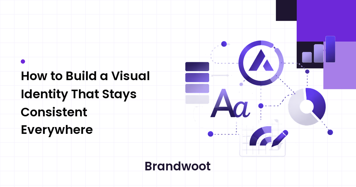
The most common mistake is treating the logo as the whole identity. A logo is one element — important, but useless on its own. A real visual identity is a system: the logo plus a defined color palette, a type system, an image style, and rules for how they fit together. The logo is what people point to; the system is what makes everything else feel like the same brand even when the logo isn't on screen.
Think of it this way: if someone removed your logo from your website, your email, and your social posts, would they still look related? If yes, you have an identity. If no, you have a logo and a lot of unrelated decisions.
Start from strategy, not taste
Before choosing a single color, you need to know what the identity is supposed to communicate. A visual identity is the strategy made visible — a calm, premium brand and a loud, playful one should make genuinely different choices, and both can be right for their audience. If you skip this, you're decorating instead of designing, and you'll second-guess every choice because there's nothing to measure it against.
Write down three or four words for how the brand should feel (for example "approachable, modern, reliable") and the audience it's for. Every visual decision below gets tested against those words. If you haven't done the underlying work, start with the brand strategy guide first — the look is far easier to choose once the positioning is clear.
The core building blocks
A complete visual identity rests on four elements. Keep each one deliberately small.
Logo
Your logo needs to be legible, scalable, and distinctive — in that order. Make sure it reads clearly at small sizes (a social avatar, a browser tab) and works in a single color, because it won't always appear in full color on white. Prepare a few versions up front: a primary lockup, a compact or icon-only mark for tight spaces, and a reversed version for dark backgrounds. There's no single "correct" logo style; the right one is whatever fits your strategy and stays clear everywhere it appears.
Color
Color is the fastest way to be recognized — often faster than the logo. Build a small palette: one or two primary brand colors, a couple of neutrals for text and backgrounds, and one accent for things that must stand out, like buttons. Resist adding more; a sprawling palette is hard to apply consistently and dilutes recognition. Two practical checks: make sure your text and background combinations are readable enough to pass basic accessibility contrast, and define your colors in the formats you'll actually use (HEX for screen, plus print values if you print).
Typography
Type carries more of your brand's tone than people expect, and it's where consistency quietly breaks. Choose a small type system — commonly one typeface for headings and one for body text, or a single versatile family used at different weights. Prioritize readability at real sizes over novelty, and make sure your choices are available where you need them (web-licensed for the site, installable for documents). No category of typeface is inherently wrong; a serif, sans-serif, or geometric face can each be the right call depending on the feel you defined.
Imagery and supporting elements
Photography, illustration, icons, and graphic shapes are what fill the space between your logo and your words — and they're often the most overlooked part of an identity. Pick one direction and commit: a consistent photo treatment, or a single illustration style, or a defined icon set. Mixing stock photos from five different looks is one of the quickest ways to make a brand feel incoherent even when the logo and colors are fine.
Tie it together with a design system
Individual choices don't create consistency — rules do. A design system (even a one-page version) is the document that turns your elements into something repeatable. It doesn't need to be a 60-page brand bible; for most small brands, a single shared page is enough to start. Capture:
- Logo usage: the versions, minimum size, clear space, and a short "don't" list (don't stretch, don't recolor, don't add effects).
- Color values: each color with its exact codes and what it's used for.
- Type rules: which font and size for headings, subheads, and body.
- Image direction: a few example images and a sentence describing the style.
- Spacing and layout basics: how much breathing room elements get.
The reason to write it down is the same reason to write down a strategy: the moment more than one person touches the brand, undocumented choices drift. A shared system lets a new hire, a freelancer, or a future you make on-brand decisions without guessing.
How to keep it consistent in practice
A system only helps if it survives contact with daily work. Three habits make consistency stick:
- Build reusable templates. Social post templates, a slide deck master, and email headers do more for consistency than any rulebook, because they make the on-brand choice the easy default.
- Centralize the assets. Keep logos, fonts, and color swatches in one shared place everyone uses, so nobody recreates a slightly-wrong version from memory.
- Audit periodically. Once or twice a year, line up your live touchpoints side by side and fix what's drifted. Consistency erodes slowly; a regular check catches it.
How to tell if your visual identity is working
You don't judge an identity by whether you personally like it. Test it against three practical questions:
- Recognition: could a customer pick your brand out of a lineup without the name attached?
- Consistency: do your website, social, and documents clearly belong to the same company?
- Usability: can someone apply the identity correctly using only your system, without asking you?
If the answer to all three is yes, the identity is doing its job — regardless of whether it follows any particular trend.
FAQ
What's the difference between a logo and a visual identity?
A logo is a single mark. A visual identity is the whole system — logo, color, typography, imagery, and the rules connecting them — that makes a brand recognizable even when the logo isn't visible. The logo is one output of the identity, not a replacement for it.
How many brand colors should I use?
Fewer than you think. One or two primary colors, a small set of neutrals for text and backgrounds, and one accent is plenty for most brands. A tight palette is easier to apply consistently and strengthens recognition; a large one tends to fragment the look.
Do I need a full brand guidelines document?
Not to start. A single-page system covering logo usage, colors, type, and image style is enough for a small brand and far more likely to be used than a long document nobody opens. Expand it only as the brand and team grow.
Can I design a visual identity myself?
You can make a workable one, especially if you keep the toolkit small and lean on a clear strategy. A skilled designer adds the most value on the logo and the overall system; the consistency work — templates, shared assets, audits — is something any owner can maintain.
How often should I refresh my visual identity?
Sparingly. Recognition is built through repetition, so frequent redesigns reset that progress. Refresh when your positioning genuinely changes or the look no longer fits the business — and when you do, roll it out deliberately rather than changing things piecemeal.
Next step
Start with an honest audit: put your website, social profiles, and a recent document side by side and look for where they disagree. Then build one small, consistent kit — logo versions, a tight palette, a type system, and an image direction — and write it on a single page you can hand to anyone. A modest identity applied everywhere beats an elaborate one applied unevenly, and consistency is what turns a new brand into a familiar one.